How to Make Your Brand Stand Out
In 2025, branding is about more than just logos and slogans; it’s about creating a visual identity that resonates emotionally with your audience. One of the most powerful tools in your branding toolkit is your color palette. The right colors can evoke emotions, communicate your brand personality, and make your business memorable in a crowded market.
Why Color Matters in Branding
Colors aren’t just pretty, they’re psychological. The shades you choose can influence how your audience perceives your brand:
- Red: Energy, passion, urgency – perfect for bold, action-oriented brands.
- Blue: Trust, calm, professionalism – ideal for finance, wellness, or education.
- Green: Growth, sustainability, balance – great for eco-friendly or lifestyle brands.
- Yellow: Optimism, creativity, happiness – attracts attention in lifestyle and family-focused businesses.
- Purple: Luxury, imagination, wisdom – adds a sense of sophistication.
2025 Insight: Soft pastels, muted earth tones, and subtle gradients are trending, often paired with bright accent colors for modern, digital-friendly branding.
Top Color Palette Trends for 2025
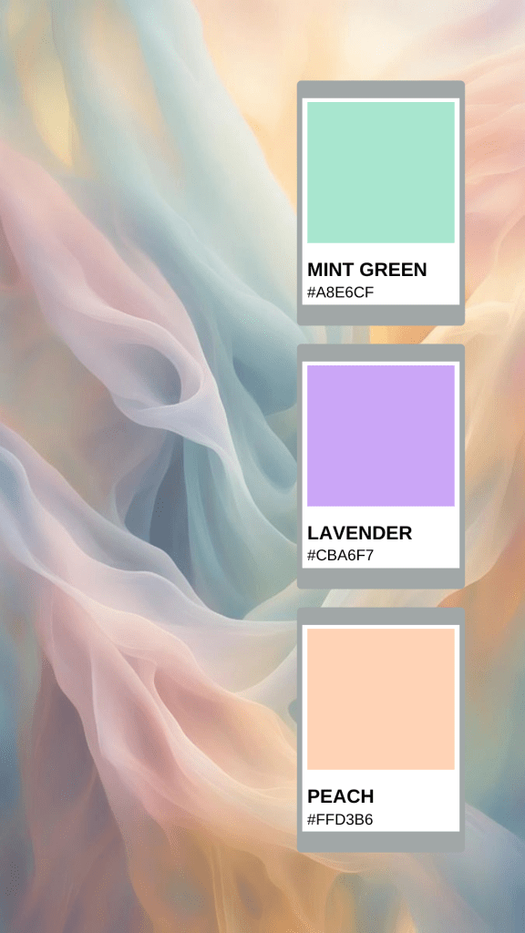
Pastel Colors
Soft shades like mint green, lavender, peach, and powder blue are dominating brand identities in 2025. Pastels convey calm, friendliness, and approachability while remaining versatile across industries.
- Mint Green
#A8E6CF - Lavender
#CBA6F7 - Peach
#FFD3B6

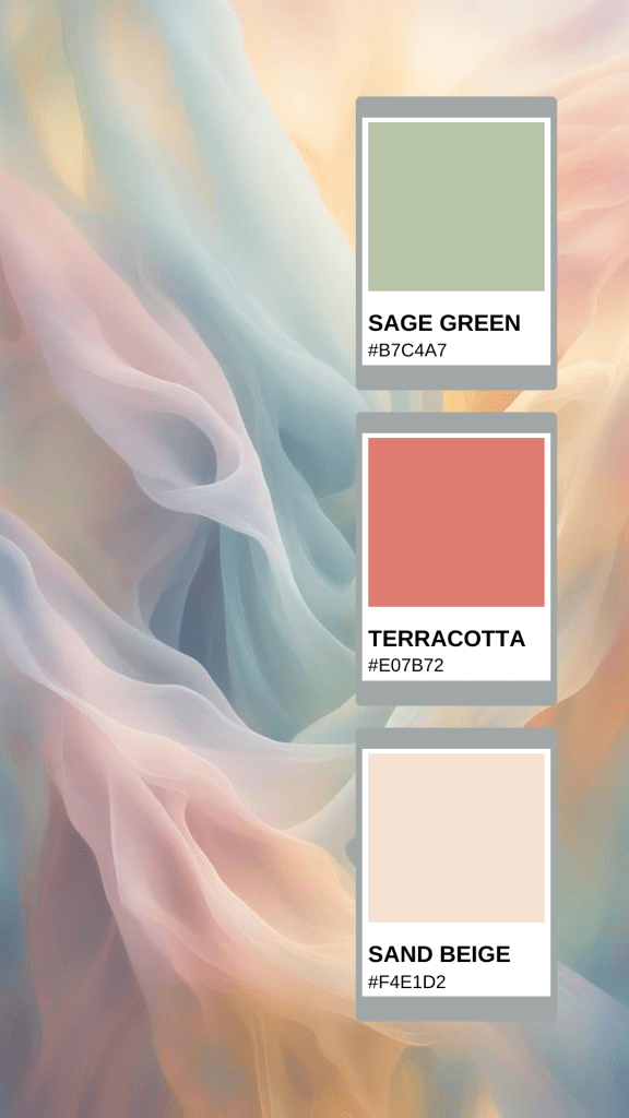
Muted Earth Tones
Shades like terracotta, beige, and sage are popular for brands focusing on wellness, sustainability, and lifestyle. They feel grounded, natural, and authentic.
- Sage Green
#B7C4A7 - Terracotta
#E07B72 - Sand Beige
#F4E1D2

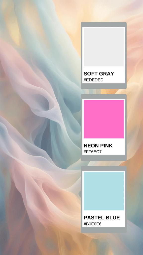
Neon Accents with Neutral Bases
In 2025, using neon highlights on soft or neutral backgrounds helps brands stand out online. Perfect for digital-first companies and social media campaigns.
- Soft Gray
#EDEDED - Neon Pink
#FF6EC7 - Pastel Blue
#B0E0E6

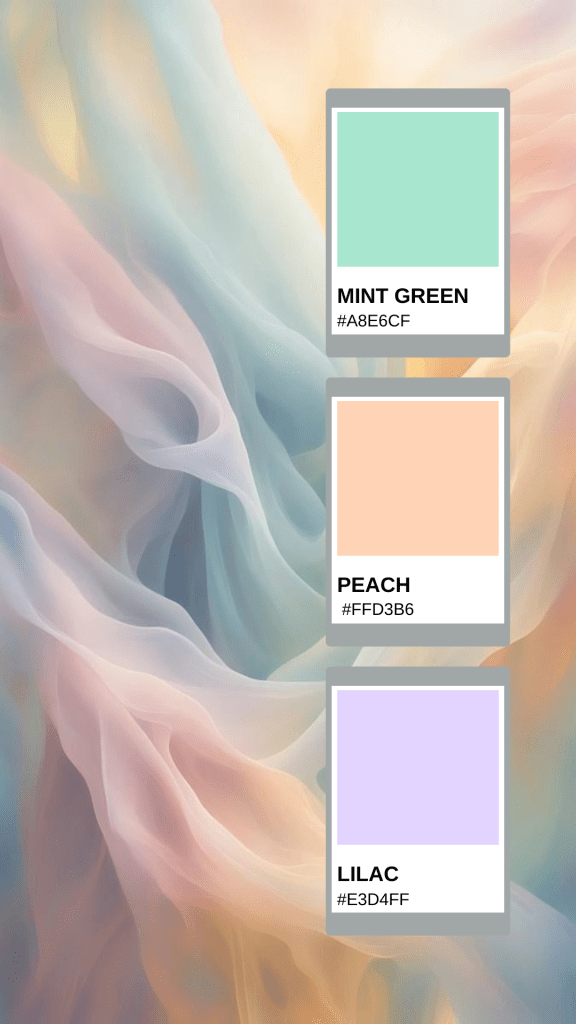
Gradients and Color Blends
Gradient color schemes are trending across websites, social media, and packaging. Subtle transitions between pastels, neons, or earth tones give a modern, sophisticated look.
- Mint Green
#A8E6CF→ Peach#FFD3B6→ Lilac#E3D4FF

Tips for Choosing the Right Palette
- Start With Brand Personality: Bold, playful, professional, or nurturing—your colors should reflect this.
- Limit to 3–5 Colors: Too many shades can confuse your audience and dilute your brand.
- Pair With Accent Colors: Use brighter or contrasting shades for buttons, links, or CTAs.
- Test Across Platforms: Ensure colors look consistent on websites, social media, and print materials.
- Document in a Style Guide: A guide ensures brand consistency across all visual content.
Final Thought
A modern color palette goes beyond mere aesthetics; it’s a powerful branding strategy. In 2025, brands that thoughtfully incorporate trending colors, whether soft pastels, muted earth tones, or vibrant neon accents, can forge a memorable and emotional connection with their audience. By selecting the right shades and applying them consistently across all touchpoints, your brand will stand out, feel approachable, and leave a lasting impression.

